BRIEF:
EXHIBIT is a multi-purpose venue in Brixton, London. Launching in August, EXHIBIT will host art exhibitions, gigs and nightclub events, and community workshops.
Framing is the primary theme of EXHIBIT's visual identity. EXHIBIT's branding and communication does not want to divert attention away from their output, but rather structure and frame their core values to allow their events speak for themselves.

LOGO:
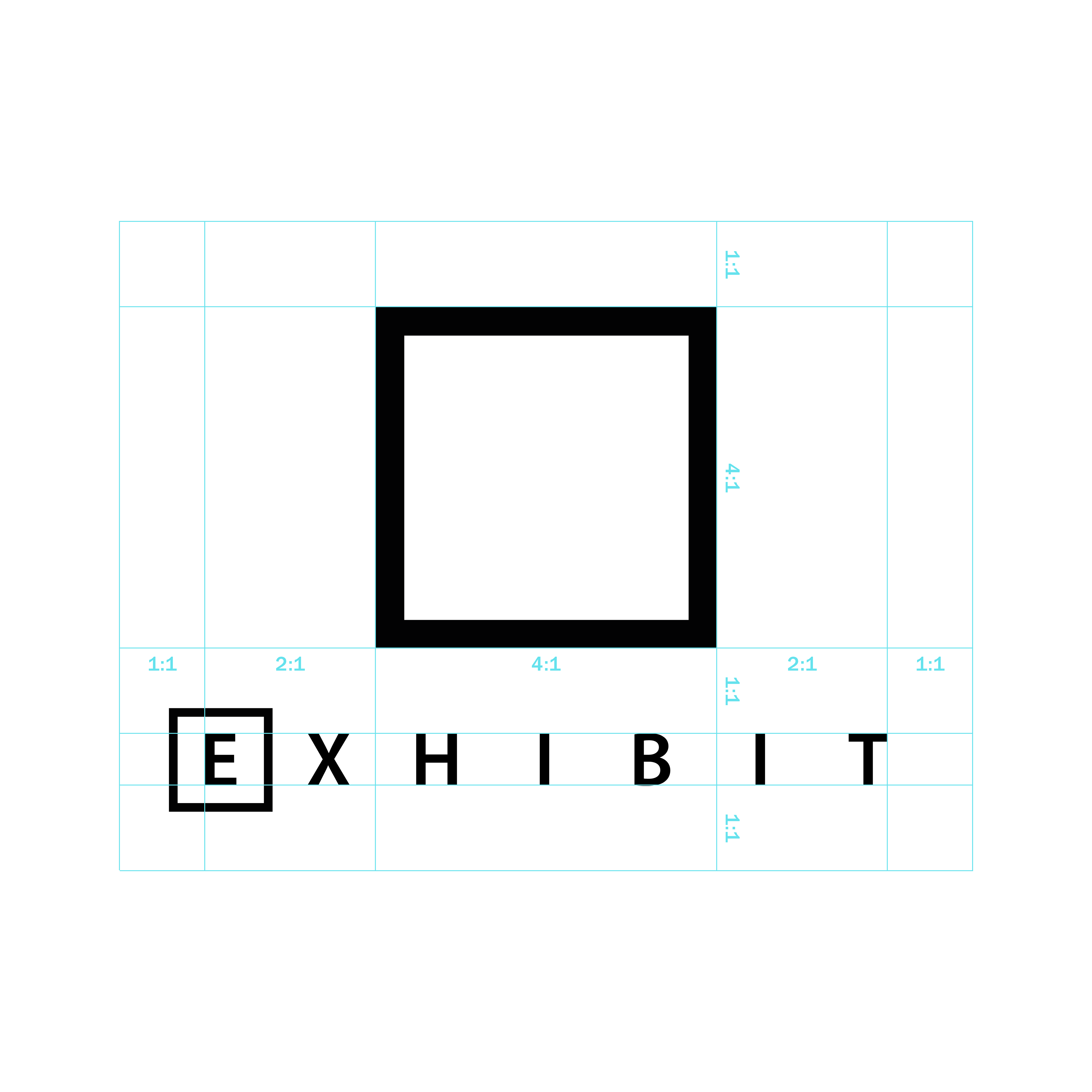
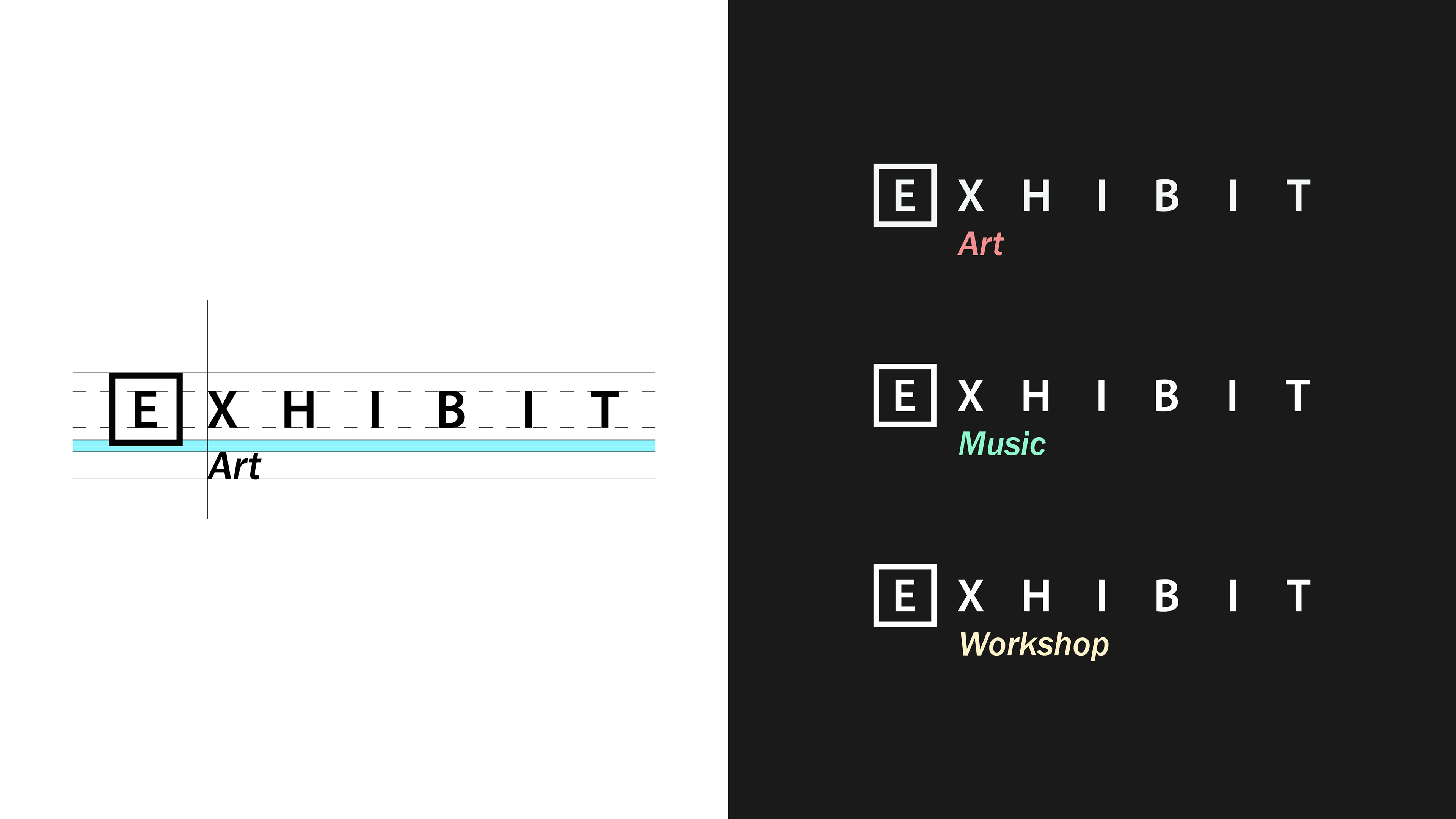
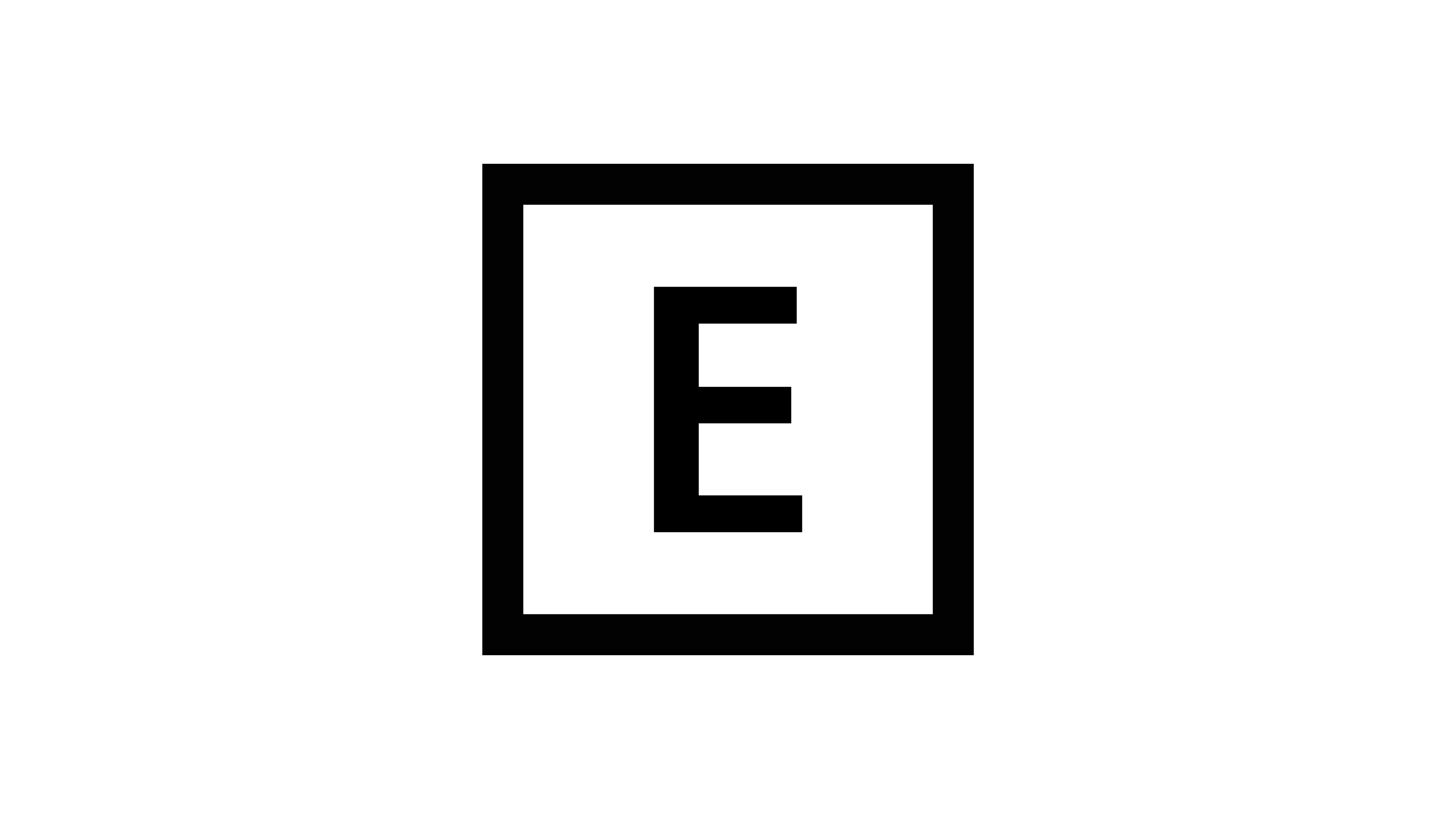
I designed their logo to be a representation of a frame in order to be emblematic of their art exhibition events and the aforementioned desire to use their visual identity to structure their core values.
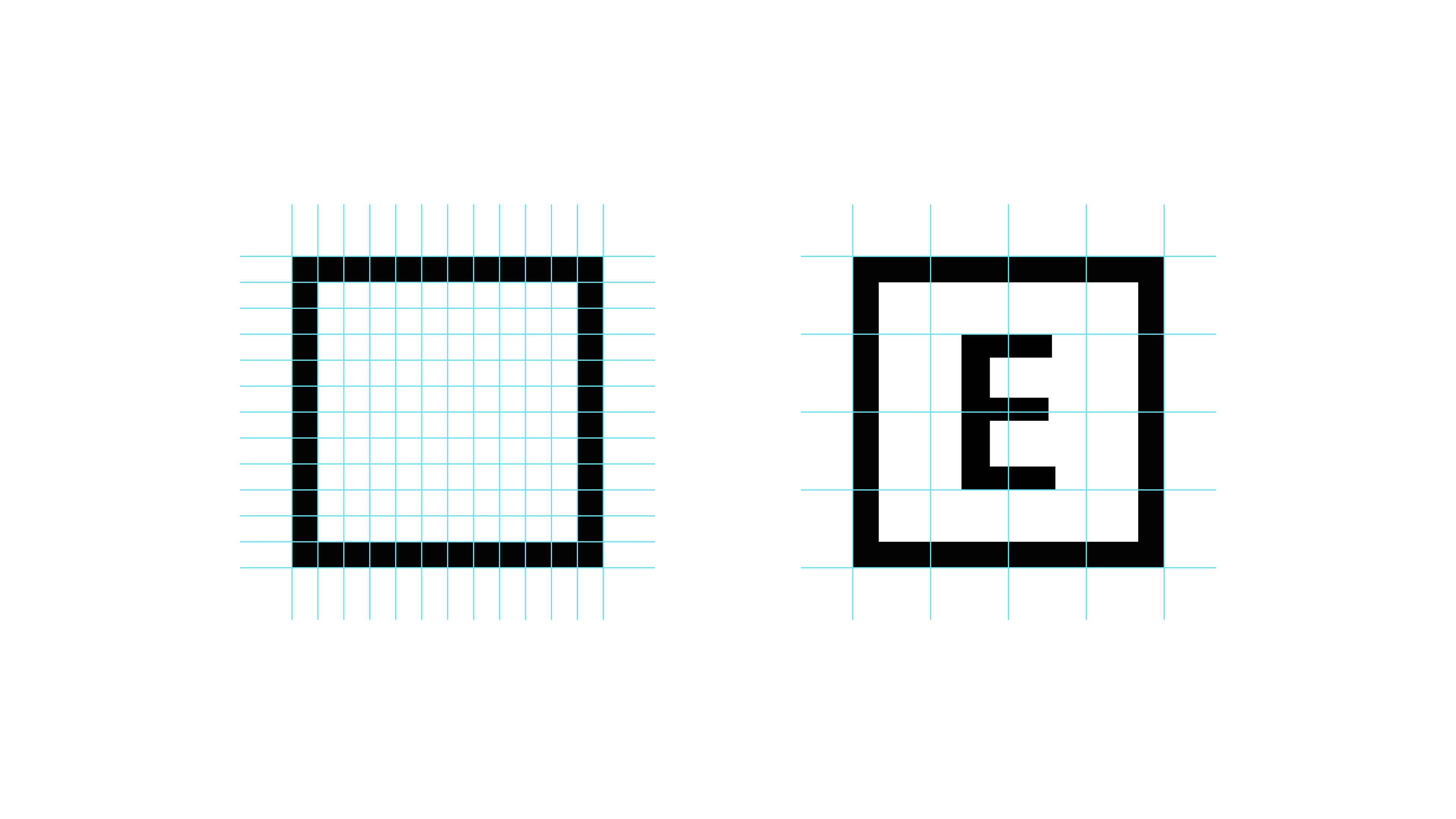
The logo is constructed using a 12x12 grid, built by filling the outer 1x1 squares and leaving the inside 10x10 as negative space. This space is filled with the "E" of EXHIBIT, resting centrally with its cap height standing standing at 50% of the grid's vertical space.
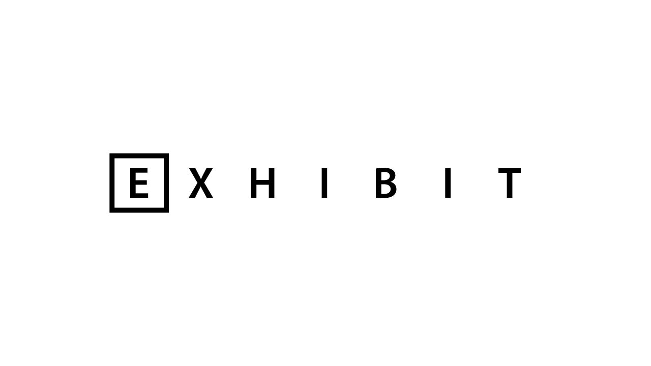
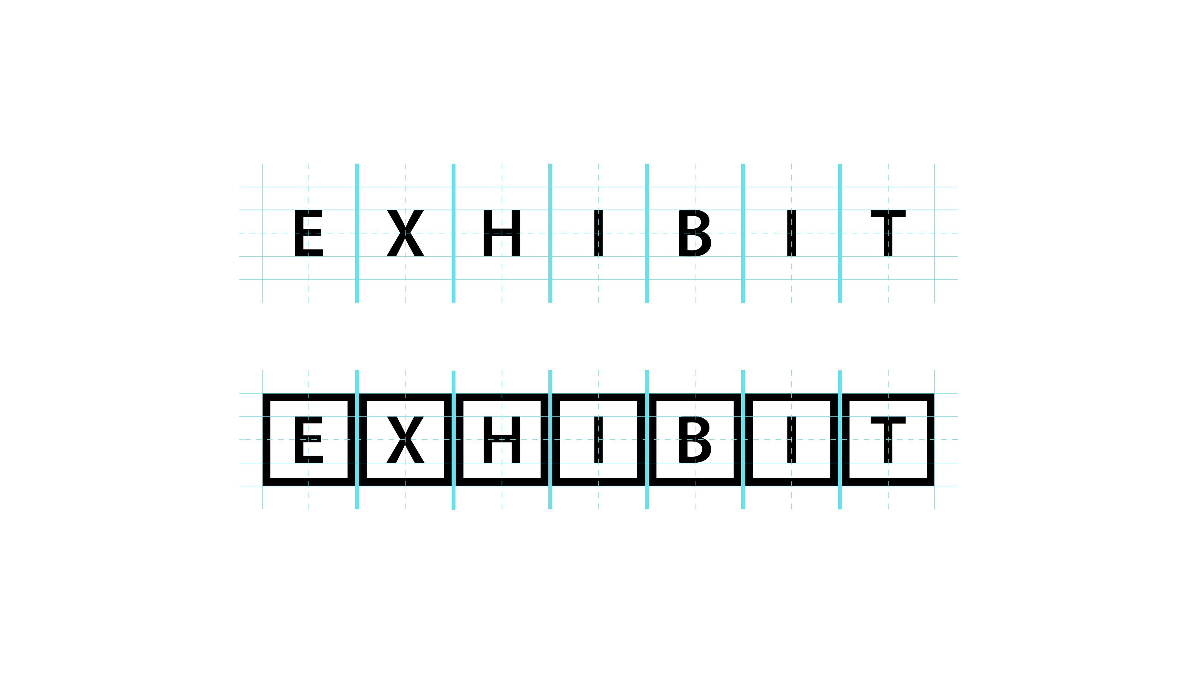
WORDMARK:
Each all-caps character within the wordmark is equally spaced on account of the logo.
As demonstrated by the lower diagram, the character's are spaced to accommodate the logo and a gap between them. For standard wordmark usage, the logo will only be used to surround the "E". This example is used to demonstrate spacing along and not for general usage.